Customizable React Table Component
Recently at work I was given the task of building a table with varying types of data. Types ranging from simple strings to full blown controlled elements like checkboxes and icon buttons. I was thinking of reaching for a library since that's where my lazy mind first went but I thought what the heck, let's try to build it from scratch. My steps and goals for building this were relatively simple:
- Make the table column widths configurable.
- Allow the table to be flexible enough to accept a wide range of data types.
If you'd like to jump to the source code you can go here.
JSX Markup
Let's start by creating our HTML structure.
function Table() {
  return (
    <table>
      <thead>
        <tr></tr>
      </thead>

      <tbody></tbody>
    </table>
	);
}

function App () {
  return <Table />
}
Here we have a table element with a thead and a tbody. These 2 elements are not necessarily needed but recommended to have within a table for semantic purposes. Within the thead we have 1 row that will hold our dynamic column names. Within the tbody we have no row elements as we will be adding those dynamically as well.
Adding Column Names
To add dynamic column names we will be passing an array of string types to the headers prop.
const headers = [
	{type: 'string', value: 'Avatar'},
	{type: 'string', value: 'Name'},
	{type: 'string', value: 'Location'},
	{type: 'string', value: 'Date'},
];

function App () {
  return <Table headers={headers} />
}
You might be thinking why don't we just pass in an array of strings like this ['Avatar', 'Name', 'Location', 'Date'] since it would be a simpler data structure right? We could but remember our goal is to make this table flexible to accept different types of data. What if instead of a column named "Avatar" we wanted to have a column with a checkbox instead? A string type is not the same as an HTML element type. Specifying the class of item will help us greatly later and make things easier when we apply our logic for rendering DOM elements as you will see. Let's add the checkbox type now.
const headers = [
	{type: 'checkbox', value: null}, // new checkbox type
	{type: 'string', value: 'Avatar'},
	{type: 'string', value: 'Name'},
	{type: 'string', value: 'Location'},
	{type: 'string', value: 'Date'},
];
Next let's go ahead and render the column names for our table. To let the table know what we expect in each header cell we will render based on the type property of the object that is being passed in:
As you can see we use a simple switch statement to conditionally render the contents of our header cells. Let's add some CSS so it looks a bit better.
function Table({headers}) {
  return (
    <table>
      <thead>
        <tr>
          {headers.map((h, i) => {
            let content;

            switch (h.type) {
              case 'checkbox': // if the item type is a checkbox the cell will be a checkbox
                content = <input className='checkbox' type='checkbox' />;
                break;
              case 'string': // if item type is a string the cell will be some text
                content = h.value;
                break;
            }

            return (
              <th key={i}>{content}</th>
            );
          })}
        </tr>
      </thead>

      <tbody></tbody>
    </table>
  );
}
.table-container {
background-color: white;
border: 1px solid #e7e7ed;
border-bottom: 0;
border-radius: 4px;
display: inline-block;
max-width: 600px;
}
table {
border-collapse: collapse;
overflow: hidden;
table-layout: fixed;
width: 100%;
}
thead tr {
background-color: #fafafa;
height: 51px;
}
tbody tr {
border-bottom: 1px solid #e7e7ed;
color: #52575c;
height: 64px;
}
td,
th {
position: relative;
text-align: left;
}
.checkbox {
position: absolute;
left: 50%;
top: 50%;
transform: translate(-50%, -50%);
}
And voila! We have the header of our table with both text for columns names and a checkbox instead of a column name.

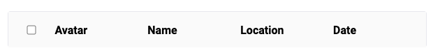
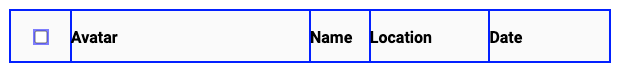
Now this is pretty good and works but we don't really have a way to control the width of the columns. Right now they will all be rendered equal in length since that is what the default table behavior is suppose to be. Let's add the ability for custom column widths next...
Making the Column Widths Configurable
We will be adding a new property called colPct to our header objects.
const headers = [
	{type: 'checkbox', value: null, colPct: 10},
	{type: 'string', value: 'Avatar', colPct: 40},
	{type: 'string', value: 'Name', colPct: 10},
	{type: 'spacer', value: null, colPct: 20},
	{type: 'icon', value: null, colPct: 20},
];
We will then add this to the width style property of each header column via inline styles.
function Table({headers}) {
  return (
    <table>
      <thead>
        <tr>
          {headers.map((h, i) => {
            let content;

            switch (h.type) {
              case 'checkbox':
                content = <input className='checkbox' type='checkbox' />;
                break;
              case 'string':
                content = h.value;
                break;
            }

            return (
              // Add custom width to each column header
              <th key={i} style={{width: `${h.colPct}%`}}>{content}</th>
            );
          })}
        </tr>
      </thead>

      <tbody></tbody>
    </table>
  );
}
Now we have some say in the matter when it comes to our column widths 😄.

Adding Rows to Our Table
So far so good. Now let's actually add some rows to our table so it actually displays some complex tabular data. Same as in our header we will be rendering elements conditionally based on the item type. Let's add a few more types to make our table even more flexible. Modify the main Table component to look like the following:
function Table({headers}) {
return (
<table>
<thead>
<tr>
{headers.map(({type, value, colPct}, i) => {
let content;
switch (type) {
case 'checkbox':
content = <input className='checkbox' type='checkbox' />;
break;
case 'string':
content = value;
break;
case 'spacer':
default:
content = '';
break;
}
return (
<th key={i} style={{width: `${colPct}%`}}>{content}</th>
);
})}
</tr>
</thead>
<tbody>
{body.map((row, i) => (
<tr key={i}>
{row.map(({type, value, props}, i) => {
let content;
switch (type) {
case 'checkbox':
content = <input className='checkbox' type='checkbox' />;
break;
case 'image':
content = <img className='image' {...props} alt={props.alt} />;
break;
case 'icon':
content = <Icon {...props} />;
break;
case 'string':
content = value;
break;
case 'spacer':
default:
content = '';
break;
}
return <td key={i}>{content}</td>;
})}
</tr>
))}
</tbody>
</table>
);
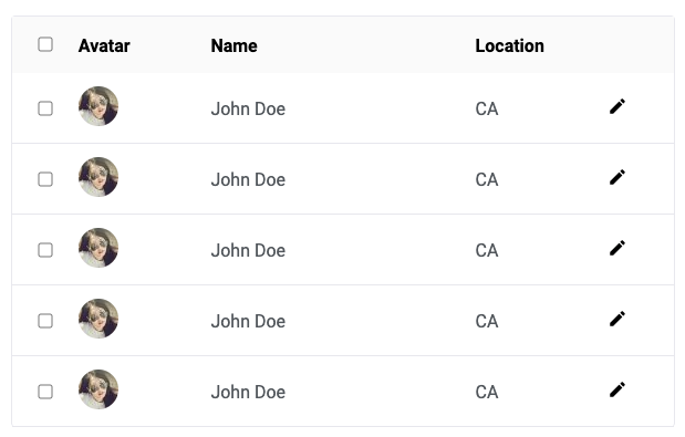
}Here, we've added a few more types to both our header and our body row mappers. An "image" type will allow us to use small images and an "icon" type will allow us to use SVG icons.
Now let's pass in a "body" prop into our component that will hold an array of rows for our table component to render.
const body = [
  [
    {type: 'checkbox', value: null},
    {type: 'image', value: null, props: {src: 'https://i.pravatar.cc/36'}},
    {type: 'string', value: 'John Doe'},
    {type: 'string', value: 'CA'},
    {type: 'icon', value: null},
  ],
  [
    {type: 'checkbox', value: null},
    {type: 'image', value: null, props: {src: 'https://i.pravatar.cc/36'}},
    {type: 'string', value: 'John Doe'},
    {type: 'string', value: 'CA'},
    {type: 'icon', value: null},
  ],
  [
    {type: 'checkbox', value: null},
    {type: 'image', value: null, props: {src: 'https://i.pravatar.cc/36'}},
    {type: 'string', value: 'John Doe'},
    {type: 'string', value: 'CA'},
    {type: 'icon', value: null},
  ],
  [
    {type: 'checkbox', value: null},
    {type: 'image', value: null, props: {src: 'https://i.pravatar.cc/36'}},
    {type: 'string', value: 'John Doe'},
    {type: 'string', value: 'CA'},
    {type: 'icon', value: null},
  ],
  [
    {type: 'checkbox', value: null},
    {type: 'image', value: null, props: {src: 'https://i.pravatar.cc/36'}},
    {type: 'string', value: 'John Doe'},
    {type: 'string', value: 'CA'},
    {type: 'icon', value: null},
  ],
]
See how we have a bunch of different types for our table component to play with? We are now dynamically telling the table component what type of element to expect for each cell and what properties should be passed to them. And that's all there is for this post! In the future I'll go a step deeper into developing this table component and add some pagination 🤗.